What is a degree?
An degree is a position and title within a college or university that is awarded in recognition of the recipient having either satisfactorily completed a course of study. The most common degrees awarded today are Bachelor's, Master's, and doctoral degrees.
What is a foundation degree?
A foundation degree is the equivalent of the first two years of an Honours degree, may be studied full or parttime, and consist of academic study integrated with relevant workbased learning undertaken with an employer. It may be studied as a stand-alone qualification or upon completion you may progress to the final year of an Honours degree.
How long do i study for?
It all depends on the course you choose becasue they can take from like 2 years to about 7 years and it depends if your gonna choose Full Time or Part Time studying.
Tuesday, 22 November 2011
Tuesday, 11 October 2011
VECTOR DRAWINGS
The Vector Images are made up from many individual, scalable objects. These objects are made with mathematical equations instead of the standard Pixels this means that they will always render at the highest quality. The objects might be created from curves lines and other diffrent shapes all with editable attributes like color fill. Changing the attributes of a Vector Object like the color of it will not affect the object it self. You can change them around with out destroying the basic shape. Because they're scalable, vector-based images are resolution independent. You can increase and decrease the size of vector images to any size you want. Advantage of vector images is that they're not restricted to a rectangular shape like bitmaps. Vector images have many advantages, but the primary disadvantage is that they're unsuitable for producing realistic imagery like photos . Vector images are usually made up of solid areas of color or gradients, but they cannot be made to look like a realistic photograph.
Some examples of Vector Drawings:


I chose these drawings because I think they show well what vector drawings are how they look and present.
Saturday, 8 October 2011
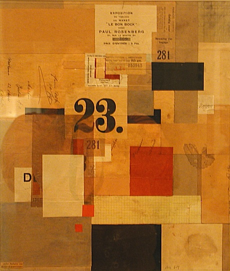
TRADDITIONAL PHOTOMONTAGE
John Heartfield was born on 19 June 1891 in Berlin, he died on 26 April 1968 in East Berlin, Heartfield is the anglicized name of the German photomontage artist Helmut Herzfeld. He chose to call himself Heartfield in 1916 to criticize the rabid nationalism and anti-British sentiment prevalent in Germany during World War I.
He was a tradditional photomontager he didint use any computer software but he was using other pictures by cutting them up and sticking them on top of other images so they look like a montage.
Some examples of his work:


His most famous photomontages scathingly mock Hitler and the Nazi party, revealing Hitler as a money-grubbing demagogue. He uses a lot of Nazi and Hitler pictures and stuff like he uses the Nazi sign very often in his work
Hannah Höch was born on November 1 1889 till May 31 1978 she was a German Dada artist. She is best known for her work of the Weimar period, when she was one of the originators of photomontage.
Hannah Hoch was born Anna Therese Johanne Hoch in Gotham Germany. From 1912 to 1914 she studied at the College of Arts and Crafts in Berlin the guidance of Harold Bergen. She chose the glass design and graphic arts, rather than fine arts, to please her father. In 1914, at the start of World War I, she left the school to work with the Red Cross. IN 1915 she returned to schooling, entering the graphics class of the National Institute of the Museum of Arts and Crafts.
Some of her work:


Hannah Hoch uses a lot of pictures of people in her work and she uses a lot of diffrent pictures its like a mixture of diffrent pictures her work is quiet Abstract.
Kurt Hermann Eduard Karl Julius Schwitters was born on 20 June 1887 lived till 8 January 1948 he was a German painter who was born in Hanover, Germany.
His work is very abstract he uses a lot of different random shapes and pictures and words
Some examples of his work:


Like i said before his work is very abstract he uses a lot of random stuff in his work like diffrent shapes and words
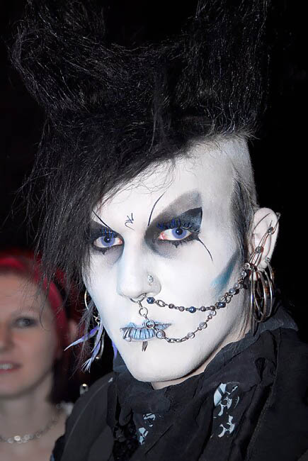
GOTHIC
The gothic subculture is found in many countries. It all started in England in the Early 80s in the gothic rock. The subculture Gothic survived a lot more time than other subculture in the era and it has continued to diversify. The Goth subculture has a associated taste in Fashion, Music and aesthetic their music encompasses a number of different style's including : Gothic Rock, Dark wave, Ethereal, Death rock and Neo Medieval.
Gothic Architecture style of architecture that flourished during the high and late medieval period. It evolved from Romanesque architecture and was succeeded by Renaissance architecture. The Gothic architecture started in the 12th Century in Franc lasting up to 16th century in architecture the Gothic style first appearing during the latter part of the Renaissance. It is in the great churches and cathedrals and in a number of civic buildings that the Gothic style was expressed most powerfully, its characteristics lending themselves to appeal to the emotions.

Monday, 3 October 2011
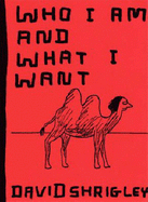
DAVID SHRIGLEY
I went through David Shrigleys's book Kill Your Pets and i think his book is quiet wierd because it only has like 3 - 5 words on each page but it has some cool phrases, they are all wrote on with a thick board marker and he has some pictures in the book

like this is the front page of the book its really big writing and its wrote on with a thick marker and its all wrote in Black Colour. After we had a look through David Shrigley's Book we had a look at his video (Who i am and what i want) i'd say the viedo was quiet strange it was a type of video which i've never seen before so it was something new.
The Video Case Cover
Tuesday, 27 September 2011
TYPEFACE CLASSIFICATION
Blackletter
Definition: Based on early written forms, blackletter is a style of typeface that features standard thick to thin strokes and serifs.
Example:
Lucida Blackletter
Fraktur
Cloister Black

Italic
Definition: While roman typefaces are upright, italic typefaces slant to the right. But rather than being just a slanted or tilted version of the roman face, a true or pure italic font is drawn from scratch and has unique features not found in the roman face.
Example:
Brush Script
Courier New
Gill Sans

Modern
Definition: In typography, Modern is a style of typeface developed in the late 18th century that continued through much of the 19th century. Characterized by high contrast between thick and thin Strokes and flat serifs, Modern fonts are harder to read than previous and later typestyles.
Examples:
Arno
Miller
Scala
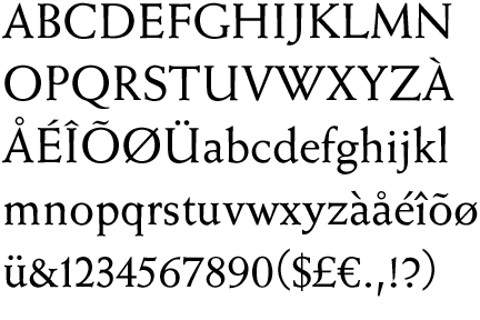
Old Style
Definition: In typography, Old Style is a style of font developed by Renaissance typographers to replace the Blackletter style of type.
Example:
Janson
Perpetua
Weiss
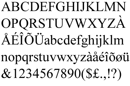
Roman
Definition: Of the three major type classifications of Western typography, Roman is the style in widest use. The others are Blackletter and Italic. Traditionally, Roman is a serif face based on a style of ancient Rome and is the typical classic serif of today. However,
Roman also refers to any upright typeface (as opposed to italic, slanted, or script), even sans serif faces.
Example:
Times New Roman
Bembo
Garamond
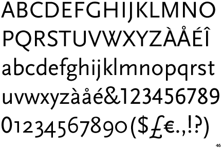
Sans Serif
Definition: Type which does not have serifs - the little extra strokes found at the end of main vertical and horizontal strokes of some letter forms - are called sans serif (without serif). Within sans serif there are five main classifications: Grotesque, Neo-grotesque Geometric, Humanist, and Informal. Typefaces within each classification usually share similarities in stroke thickness, weight, and the shapes of certain letter forms.
Example:
Arial
Dax
Optima

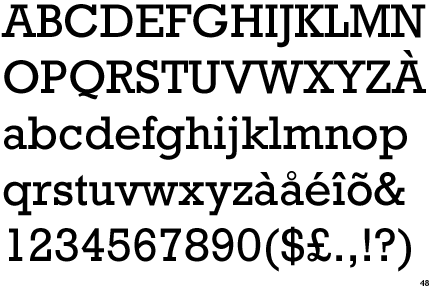
Serif
Definition: In typography, a serif is the little extra stroke found at the end of main vertical and horizontal strokes of some letter forms. Some are subtle and others may be quite pronounced and obvious. In some cases serifs may aid in the readability of a typeface.
Examples:
Rockwell
Georgia
Centaur
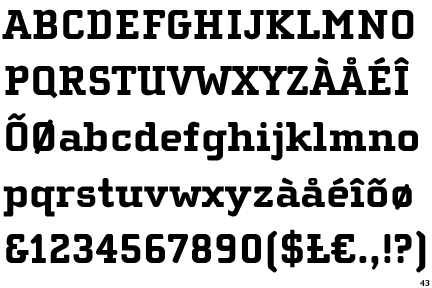
Slab Serif
Definition: A Slab Serif is a type of serif font that evolved from the Modern style. The serifs are square and larger, bolder than serifs of previous typestyles.
Example:
Apex
Cholla Slab
Egyptiene
Subscribe to:
Posts (Atom)