Wednesday, 12 June 2013

Camera

The Cameras history could be traced much further than the introduction of Photography. The first ever camera was a developed version of the camera obscura, which started off the evolution of Camera. The cameras where getting better as well as the photographic technology which included daguerreotypes, colotypes, dry plates, film and digital cameras.

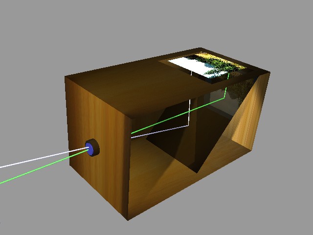
The Camera obscura was the first ever device which allowed people to project an image onto a surface. The image was up-side down because of how the camera worked, however when the image got onto the viewing surface it looked normal as the image would reflect of the mirror inside the camera. The camera used either a pinhole or lens to project the image. 


The photo above shows what the camera obscura looked like and how it worked, as we can see the white line took the top side of the image while the green line would take the bottom side of the image they went in through the lens where they swapped places (up-side down) but then they both would reflect off of the mirror which made the image look normal on the viewing surface. 

The creation of permanent images started off with Thomas Wedgwood in 1790 and also Joseph Nicéphore Niépce in 1826. They were both well known for begin the inventors of Photography. Thomas Wedgwood was one of the first people who experimented within the Photographic field. He is the first person who had thought of creating permanent images. 

Joseph Nicéphore Niépce was the person who developed heliography which used a a naturally occurring asphalt, as a coating on glass or metal after the coating hardened in proportion to its exposure to light. When the plate was washed with oil of lavender, only the hardened areas remained which formed a permanent photo. 


This was one of the first photos ever made. It was taken by Joseph Nicéphore Niépce in 1826. 

Monday, 10 June 2013

Painting

Paintings is the way of creating pictures by applying color to a surface like canvas. Paintings can tell stories, express emotions, express ideas, decorate walls and many other things.
Painting began many years ago, early humans used charcoal and minerals to create powders which they used to make images on cave walls. Sometimes they mixed the powder with saliva or animal fat which formed a fluid which they could use as paint, they most likely applied the fluid with their fingers. 

Artists normally create paintings of visible world: 

  • People
  • Landscape
  • Still life
  • Historic Scenes

This table shows us the Key Schools of Painting

SCHOOL
CENTURY 
KEY WORKS
Gothic
13th–15th
The Annunciation, Simone Martini
Renaissance
14th–16th
The Arnolfini Marriage , van Eyck School of Athens, Raphael
Baroque
17th–18th
The Descent from the Cross, Rubens
Rococo
17th–18th
The Swing, Fragonard
Neoclassicism
18th–19th
The Oath of the Horatii , David
Romanticism
18th–19th
The Raft of the Medusa, Géricault
Impressionism & Post-Impressionism
Late 19th
Dance at the Moulin de la Galette, Renoir; Mont Ste Victoire, Cezanne
Cubism
20th
Les Demoiselles d’Avignon, Picasso


There's two different ways of painting, the realistic painting which makes the painting look like something real. The second way of painting is the abstract way which is not supposed to look like anything from the real world, but different colors, shapes and lines are used to express ideas, feeling and moods.

Paintings are flat where the real world is three dimensional, most artists use methods such as perspective painting to make the painting look like its real. Perspective is a way of showing the three dimensional things on a two dimensional surface. In the real world the further away the object is the smaller it looks, and the parallel lines appear to meet. The perspective mimics this. 

The perspective was developed in Italy by two painters Leon Battista Alberti (1404–1472)
 Filippo Brunelleschi (1377–1446) they made a mathematical system which they experimented with. The invention of perspective enabled artists to accurately represent three dimensional objects on a 2 dimensional surface.

The Vanishing point could be described as a line where the sky meets the land. The vanishing point is a spot where lines which are parallel in reality appear to converge in the distance on the painting. As the lines move inward toward the vanishing point they lead people’s eyes into the painting imaginary depth.


The Mona Lisa is a portait of a woman by the Italian artist Leonardo da Vinci, the painting has been acclaimed as: the best known, the most visited, the most written about, the most sung about and the most parodied work of art in the world.


Sunday, 9 June 2013

Artists

The 3 artists which I’m going to look at are Cory Holms, Olly Moss and Jonathan Wilkinson I choose them because I really like their work and they inspire me to work better.
The artist which I’m looking at is Cory Holms I choose him because he’s a really good designer he has worked with a lot of big companies like : Mojo, Crew Creative Advertising, Sapient he studied at the B.F.A. Graphic Design / School of Art he has done a lot of good work past time 


Like this piece of work is a good design Logo / Title its quiet hard to read the text at the first moment but if you look at it the text becomes visible which shows that his work makes people think about it and want to know what is he text so they have to look at it if they want to be able to read the text.
This logo which he designed is different to the one before but it’s similar at the same time.


At the first moment the logo looks like 4 circles which go on top over each other but it’s actually a logo which says coco it uses 3 different colours : Red / Blue / Yellow these colours are all different so the logo has a good contrast and so that it’s easy to see what’s on it but also because the text is on top of each other it’s also hard to read the text from a distance because it looks like 4 circles where if you get closer u can easily see what the text says.


This shows us that the Artist uses similar techniques when creating his work he has worked with a lot of big companies which means that his work must be good which shows that the techniques which he uses work perfectly and are good they work perfectly because they make people want to see what the logo says and means. When this happens it catches other people’s attention and if it’s like a big clothing company and the logo catches some people’s attention it will get the company some clients

Corey Holm's Summary: 


Graphic Designer with over 10 years of experience specialising in print. Identity, collateral, poster and type design are the areas I focus on within the world of print design.
Corey Holms’s Specializes in:


Art Direction, Design, Poster, Typography and Type Design
Cory Holms also makes other people / companies use his work. 


On this logo he used a simple picture of a gun instead of the r which grabs people’s attention and makes other companies use the pistol idea instead of the “r” it has been used by comedy programs such as The Simpson's, and used in many look-alike logos.
He chooses to do the simple logos prints but he makes they tricky to read, understand, tell what they mean which makes him a good graphic designer he creates some amazing print designs in which he uses a lot of different and simple techniques which makes his work tricky but simple at the same time.
Olly Moss is a very good designer/illustrator; his self initiated work includes illustrations, graphics, t-shirt designs, posters etc. He uses a lot of bright eye-catching colours, with very simple designs. His work is really good and is used widely around the world.


I like these pieces of work which were made by Olly Moss he has a nice style and he uses a really good technique. The technique is that he makes one picture out of 2 so they have 2 completely different meaning like THE BLACK KEYS it’s a lamp which is turned on and the light coming out of it looks like a key hole which makes the 2 separate look like one but with 2 different meanings. The other picture the Dirty Harry has been made with the same technique it has 2 different pictures which creates one picture there’s a picture of a gun which creates a face of the side of it from the way it looks this is a really good technique because it catches peoples eye’s by making one picture out of 2 which makes people want to see the both pictures understand them and know what they mean. He uses 2 – 3 colours in his designs which makes them look simple and have a good contrast between the colours although the colours and style make the designs simple they are tricky because of the 2 pictures 2 different meanings which create 1 picture with 1 meaning. This work is very tricky but simple at the same time which is hard to understand it at start but it will be easy to understand it people see them from the simple side. 


Olly Moss is a different designer to Corey, who does a lot of Art Print work, Designing Logos etc where Olly specialises in stuff like Illustrating and sketching. I really like both of the artists but I prefer Olly Moss more cause of the style he has and techniques he uses all of the digital and modern stuff but as well as all of the modern u will be able to find the Traditional stuff which makes his work look well as well as using both modern and traditional he uses his sketches with his digital work which makes it even more interesting.
Olly is a very good designer with a good style I really like the style of this piece of work.
I really like it because of how it looks it shows us that Olly likes sketches cause of the sketch style the piece of work above has a really nice simple sketchy style which I really like because of how simple the work looks I prefer drawings which include like everyday objects like all of the cameras and the lenses for the camera.

Olly has worked with a lot of big companies which a very popular all around the world like:


  •      Lucasfilm / Star Wars
  •      Star Trek
  •      ABC / LOST
  •      Levis
  •      The Alamo Drafthouse
  •      Urban Outfitters
  •      Nike
  •      Puma
  •      Penguin
  •      Wired
  •      GQ
  •      The New York Times
  •      The Guardian
  •      The Financial Times
  •      The Independent
  •      Money Magazine
  •      Threadless

From all of the companies Olly has worked for I can tell that Olly is a good designer and has a talent in Graphic Designing.


The third artist I’m looking at is completely different to Cory and Olly. It’s Jonathan Wilkinson he has lived and worked in Sheffield for the last 11 years. While he was born in Leeds and grew up in Nottingham. His story began while he was getting his A-level’s in technical drawing, when things were done the old fashioned way with ruler and pencil. He went on to study Fine Art at the Psalter Lane campus at the Sheffield Hallam University.
I really like Jonathan's work because he uses the same style all the time he always draws buildings.


I find his work really Interesting because I’m interested in Architecture where most of his work is drowned in a Architectural way but although they are drowned in a Architectural way they have some colours the sky is always in colours which makes is look really good cause it adds a contrast to the drawing because everything else apart from the sky is Black and White. He has a lot of drawings of Stuff in Sheffield like buildings some of the buildings he drowned I have probably seen but didn’t notice. All of his work is really straight and perfect it’s all done with a ruler and a pencil but on a Computer. I have noticed that a lot of his drawings are 2D which makes them easier do draw and look at and when they are 2D they have no shadows on them where the 3D drawings he did always have Shadow on them which makes them look more realistic than the 2D drawings and the 3D ones make people think that the shadow is what Jonathan did see when he was drawing the Building which tells us where he had to stand and be to see what we see on the building so all of his work is Still live drawings.


The 3 artists I looked at are all different to each other because Cory Holms is a Designer he does a lot of logo designs and prints, Olly Moss is a Illustrator which does a lot of sketches and puts them with his digital work and then presents them digitally, Jonathan Wilkinson is a architect with a simple neat style which makes his work look perfect with a bit of Art in it.
Today from the Research I did I have learnt that some of the work can and has to be perfect and straight but some of the work we do in are can be what we want it to be it doesn’t have to be perfect or done with a ruler.
ARTIST Research

While we were doing our Induction Project we had to do some research on few Artisits the artists i looked at and liked the most were Olly Moss, Shepard Fairley and Cory Holmes I liked their work because of the style the work was and the way they looked.

Some examples of Olly Moss's work :

I like his work because he has his own unique style. He normally creates 1 piece of work which has 2 different pictures/meanings to it, I really like this Star Wars pieces of work because they all look very similar but have different meanings. 

Some examples of Shepard Fairley's work :


I really like his work he's my favourite artisit which i looked at because of the work he does. I really like the idea of taking pictures and chaning the colour of them into Blue and Red with a bit of diffrent colour and making them look really good like the posters above are really good acording to me bacause of the way they look. I also like the idea of taking photos of famous people and changing them around to your own style. 

Some examples of Cory Holms's work:


I really like the type of work which Cory Holms makes. He mostly creates logos for knows companies like Adobe, Discovery etc I really like his work because he makes the logos very smiple he normally uses 2 colors Black and a different one which makes his work really nice.

THE SWASTIKA


The swastika symbol has been used in various ancient civilizations around the world.  It has been used in Indian Religion specifically in Hinduism and Buddhism primarily as a secret symbol of good luck. But the swastika was used as the symbol of the Nazi Party of Germany in 1920 after Adolf Hitler’s rise to power in 1930.

Artist SYLVIII

The other artist which I like is Sylviii the artist creates some simple work which is very clear she uses a lot of Animals in her work she also creates Vector Drawings of Maps and skulls most of her work is black color on white background but she creates some color work which mostly is icons she creates a lot of different icons with different colors or she creates the one icon and just changes the color of it so she has like 6 copies of the same Icon but in different colors he has a very simple and clear style her work is easy to read and understand. The map art work she creates are maps of different countries, the color of it is black on white background she fits like 6 drawings on to a page with a readable size but if you cant read it you can zoom it in as much as you want because it’s a vector drawing.

Some examples of Sylviii’s work


I really like the art work created by Sylviii as its very simple. She creates very nice vector drawings of maps, animals etc but she also makes Icons like the ones above its a RSS icon which has been made once but the colour of it has been changed 6 times which is a very good idea as it shows us what the icon could look like in different colours or maybe in different colour schemes. 

Artist ROBOT

I really like Robot’s work he creates some really nice Vector Drawings. He has a lot of different artworks which I really like cause of the look of them the colours and the style he puts into his work he creates a lot of Vector Drawings which include a lot of Music stuff like cassettes and turntables and he has of lot of work which includes graffiti like spray cans and the graffiti’s itself but also he creates work which includes City he has a few pieces of work which have stuff like Power lines in them and he has some with Traffic Lights so he has a lot of different artworks but they all are similar style similar color and similar look he has like a Graffiti style which I really like. He’s a very good artist which inspires me and will probably help me with my work in future. He’s not the only Vector Drawings creator but he’s a very good one which creates very good work. 

Some examples of Robot's artwork: 


This work was made by Robot and i really like the way they look they aren't that simple but they are easy to read and easy to understand so they are simple at the same time as they aren't which makes Robot a very good artist. Creating pieces of artwork which are like these ones above is not very easy as it takes a lot of skill. One of my favorite artwork created by Robot is the Cassette in the middle it looks really good because of the colors match together and they look well together.

Justin Spice

Saturday, 8 June 2013

ENVIRONMENTAL POSTER STYLE RESEARCH

Antonio Carusone

Was born in Queens, New York into a colorful Italian family. Carusone has been in creative arts sine he was young.He currently resides in New York City where he's an Associate Creative Directior at Ogilvy. He has also won Caple Design Awards for his work on Wisk and Jose Cuervo. 


Here is some examples of Carusone's work he creates some nice simple posters which In my opinion look really nice because of the mixture of colours and because of how simple they look.

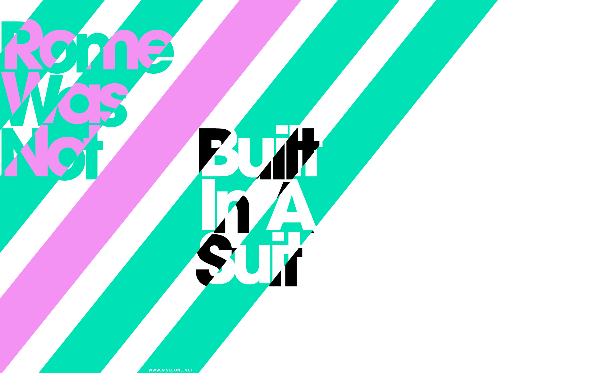
Here is Antonio Carusone blog http://www.aisleone.net/ which has some really good examples of other artists work as well as his. 


 Swiss Dots, the producers of the Helvetica documentary, have create this new limited-edition screenprint for the film. The print is inspired by a 1960’s design that has been seen on D. Stempel AG brochures, type specimens and posters — which has been making an appearance on the TV show, Mad Men.

Here a found another Blog which has a lot of difrent Swiss International Style Poster/Artwork examples 


David Mackenzie Ogilvy was born in West Horsley, England, on June 23, 1911. He was educated at Fettes College in Edinburgh and at Christ Church, Oxford (although he didn't graduate).

In 1938, Ogilvy emigrated to the United States, where he went to work for George Gallup's Audience Research Institute in New Jersey. Ogilvy cites Gallup as one of the major influences on his thinking, emphasizing meticulous research methods and adherence to reality.

In 1948, he founded the New York-based ad agency Hewitt, Ogilvy, Benson & Mather (which eventually became Ogilvy & Mather Worldwide), with the financial backing of London agency Mather & Crowther. He had never written an advertisement in his life.

Thirty-three years later, he sent the following memo to one of his partners:
Will Any Agency Hire This Man?
He is 38, and unemployed. He dropped out of college.
He has been a cook, a salesman, a diplomatist and a farmer.
He knows nothing about marketing and had never written any copy.
He professes to be interested in advertising as a career (at the age of 38!) and is ready to go to work for $5,000 a year.
I doubt if any American agency will hire him.
However, a London agency did hire him. Three years later he became the most famous copywriter in the world, and in due course built the tenth biggest agency in the world.
The moral: it sometimes pays an agency to be imaginative and unorthodox in hiring.

 Some of Ogilvy's work which i think is really good to look at because the artwrok is very simplistic and easy to tell what he means which is important in designing posters. 


I think that all of the above posters are great as they all send out a strong message. My personal favourite is the one about Buildings "Buildings bring down their own enegry costs." I really like this particular poster because of the simplicity. The buildings are very simple its beasically few rectangles which were streched and then few arrows got added which had the same colour as the background which is a very simple design with a very strong message and thats what makes these posters special.

Thursday, 1 March 2012

CHESTERFIELD

Today we had to go down to chesterfield to take some pictures of Visual Signage and some of the Buildings. We had to take them pictures to help us in the future project which will be on Chesterfield. We were meant to walk around the Town and take pictures of what ever we liked e.g. Architecture and Signs.